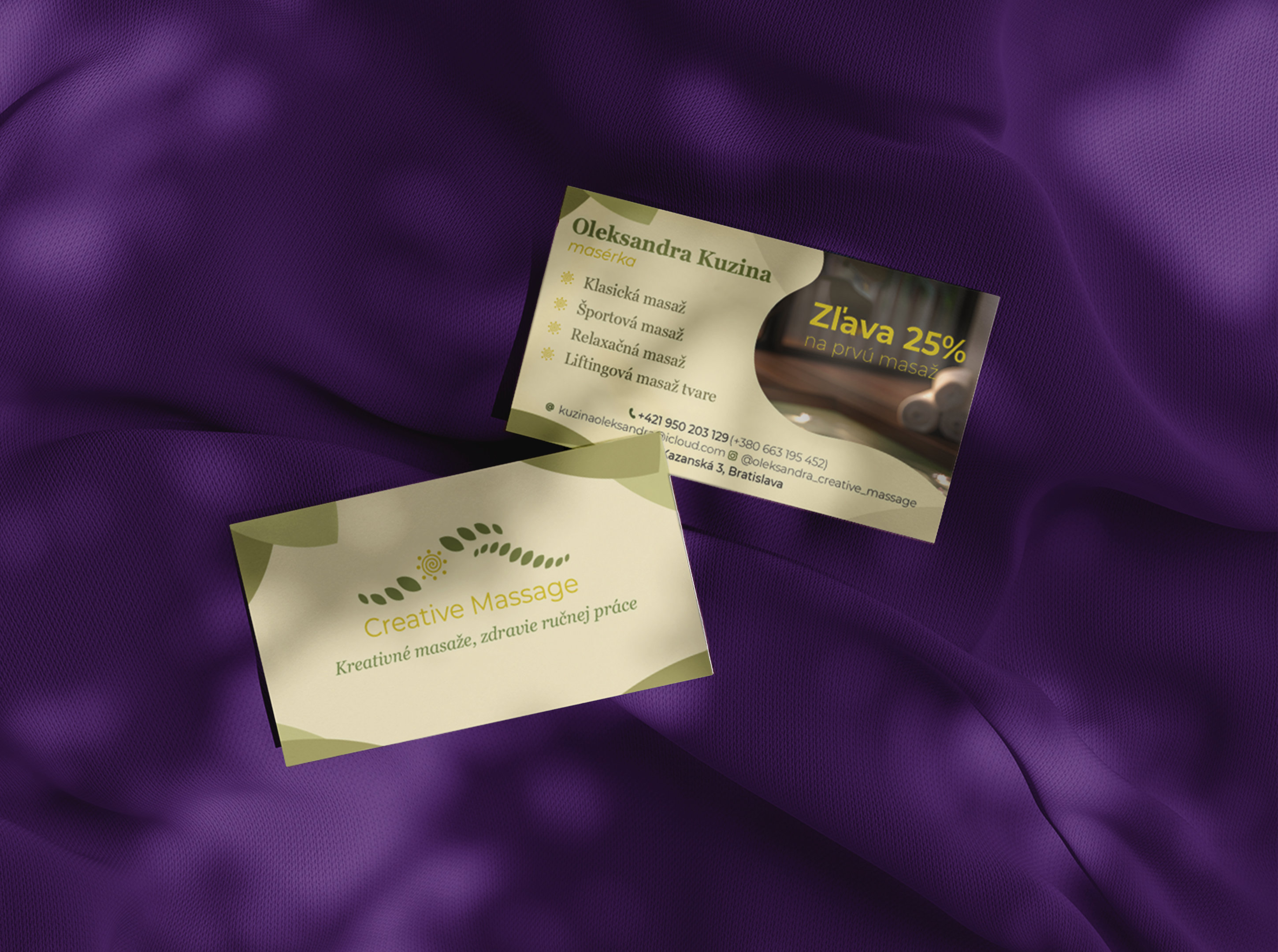
Creative Massage
identity
Brief
Creative Massage needed visit cards. What they got was a little more than that.
Process
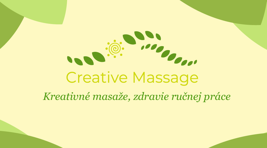
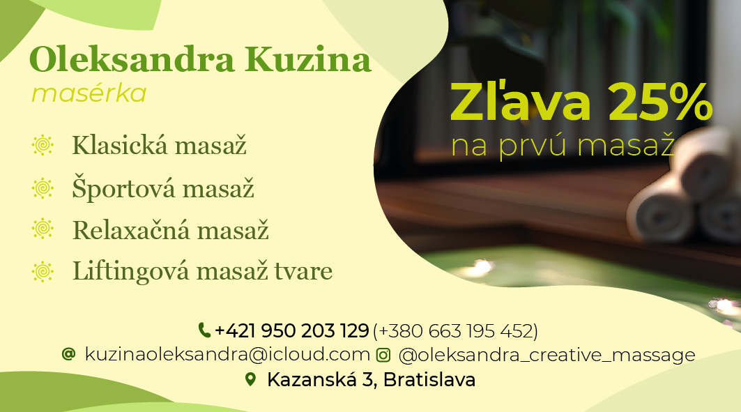
When I saw the existing logo, I knew the visit cards would only work if we fixed the foundation first. I proposed a full logo redesign — the client agreed. Working from instinct and experience, I defined a warm, welcoming colour palette and typography system, essentially building a mini brand identity in the process. The visit cards were then designed within that system, balanced and considered, with a discount element woven into the layout without disrupting the overall feel. Every element had a reason to be exactly where it was.
Result
A new logo, a coherent visual identity, and print-ready visit cards — delivered as a complete package. My first paid design project.